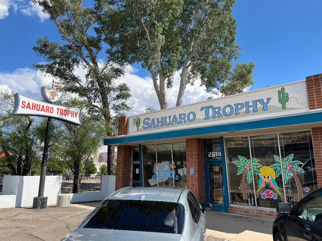
Original Sign

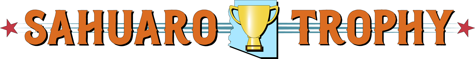
New Sign Design Mock-Up
This design was a sign refresh. We were instructed to "level up" a sign we saw around town that maybe needed a facelift. Sahuaro Trophy was my choice.
The trophy shop is around the block from where I live and I always see it driving by. It is a family owned operation for over 30 years. The logo looks like it was applied on the building around that time. It works, but I feel like to gather new eyes and increase interest a refresh on the logo would be appropriate. This would probably help generate a little more traffic for the business along with a strong marketing campaign.
My approach was to take the limited space and just improve on what was already there. The main focus was the typography and giving some elements that would make it feel local. I wanted to include a trophy and something true to the community so I went with Arizona's state outline. From there it was just making sure the smaller elements didn't make the sign feel busy or distract from the company name. I chose orange and blue to represent the desert (sahuaro) and the sky respectively. Blue and orange are one of my favorite color combos and I think makes the sign "pop".
I'm proud of this design just because the space is kind of awkward with the vertical limitations so really focusing on the typography and making something local, professional, and organized was my goal.
Everything was designed in Adobe Illustrator.