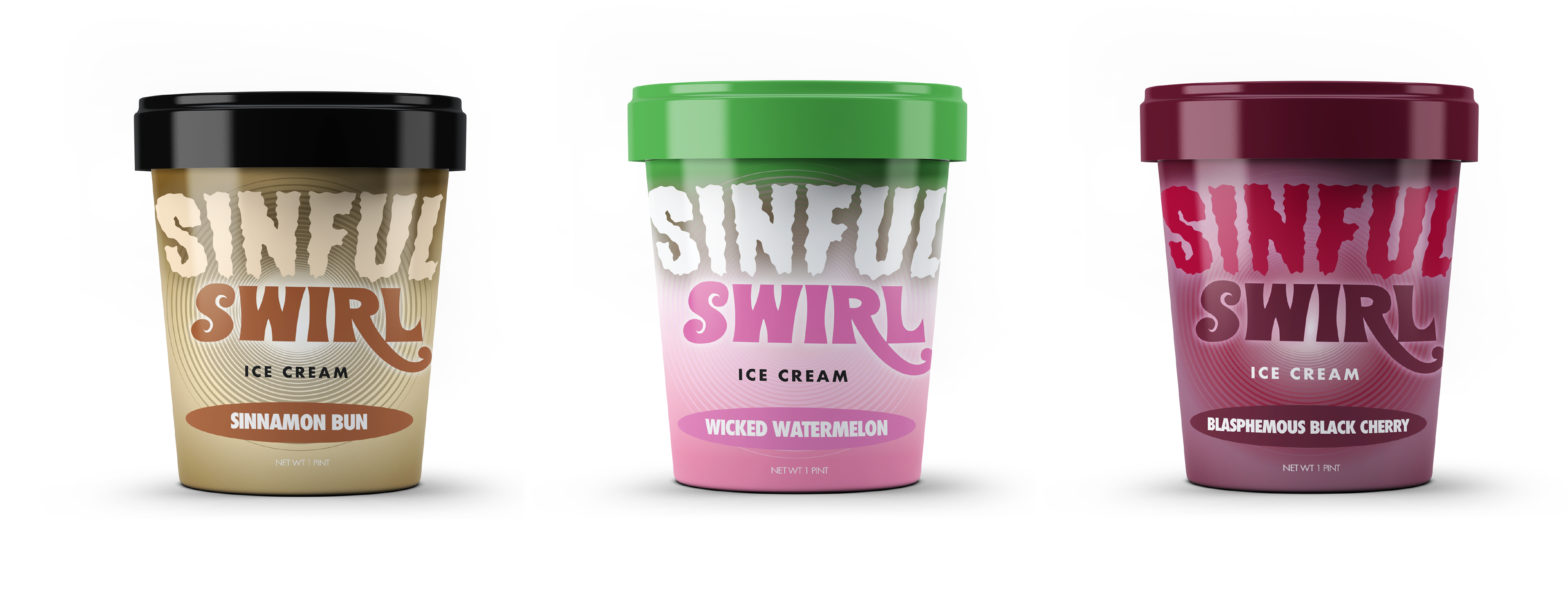
This design required a typographic packaging line up for an ice cream brand. We had to brainstorm as a group to think of a brand name and then each create our own line up of flavors and names for the brand name. The brief required typography only (shapes were allowed as well), but no illustrations.
With this in mind I wanted to play on the idea of dessert being sinful. Sometimes we want to be bad, right? This idea allowed me to be playful with the type choice and colors. I also wanted to do a subtle spiral shape in the background to almost "hypnotize" the consumer.
I think as a typographic ice cream package it's effective with its message. I think if I was walking through the frozen foods section the colors and bold typefaces would attract my attention. I also think the typography is unique compared to most ice cream brands on the market which may attract new demographics.