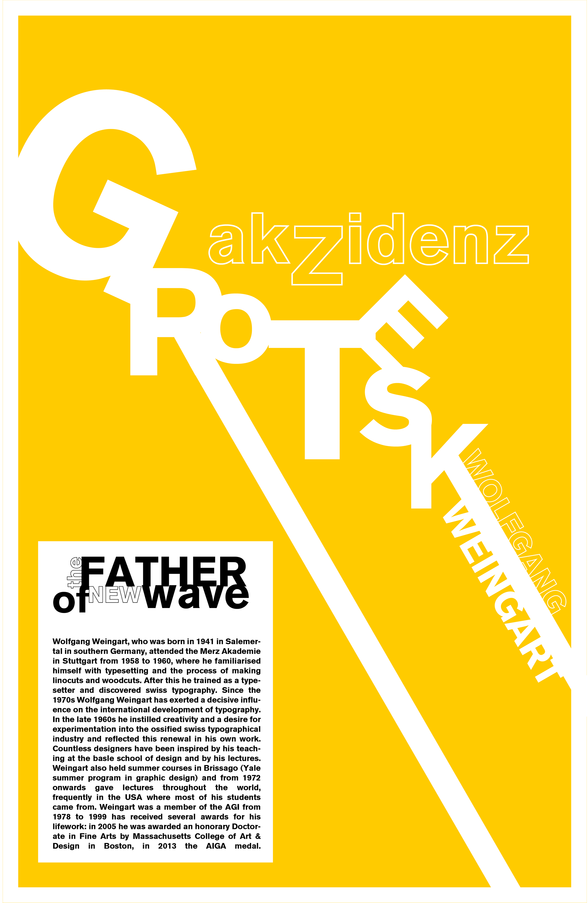
This design was required to highlight a typographic designer with their style or font in Adobe Illustrator. No images were allowed for this assignment as the focus was solely on typography.
Upon researching I really loved the style of Wolfgang Weingart and his experimented approach with type. He went against the normal rules of typography and made a style that was really unique and bold called "Swiss Punk" or "New Wave". These styles are still used today.
I wanted to lay out the text of "Akzidenz Grotesque" in a dramatic scale with the letters arranged in an obscure way. This really had the Weingart feel. I also chose German-esque colors to drive that bold feel in. The poster has a masculine tone with the the color and type choices. The negative space gives the reader a chance to adjust their eyes and focus on the subject matter easily.
I love typographic design because text and arrangement can really change our perception and feeling toward a subject. There is a lot of emotion and storytelling in just a style of words.